
Mindhacks posted this timeline, published by Back, Kuffner and Egloff in Psychological Science, of emotions (sadness, anxiety and anger) expressed in Americans' pager messages on 9/11 2001. It seems to speak for itself and, probably unwittingly, fills in the gap in David McCandless' Mountains out of Molehills which maps media scare stories between 2000 and 2009, showing an apparent drop in stories when there were real, tangible fears in 2001-2. (McCandless discusses some of his visualisations at TED, here.)
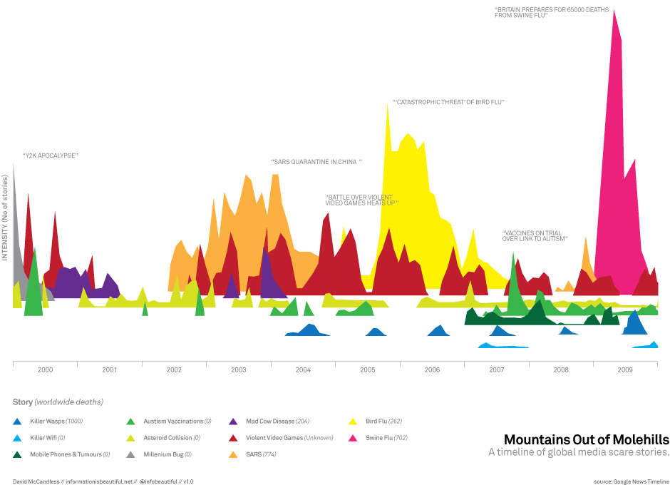
Powerful as these visualisations are they leave me asking questions about their context: in the 9/11 case, what is the background level of emotion expression, without the stimulus of a calamity (the vertical scale in the diagram is huge); in the McCandless visualisation, again, I'd like more understanding of the vertical dimension; the relationship between level of fear and number of actual deaths (easily missed below the table) is also fascinating.
Hunter Whitney in UXMagazine briefly reviews the scope of data visualisation, his examples giving insight into the power, but also the potential for very individual interpretations, it brings.
Completely unvisualised, and also open to questions and interpretation I liked this comparison from The Paranoid Parents' Guide between American parents' top five fears about their children (on the basis of interviews) and the top five actual hazards (from accident data) children face:
Parents' fears Kidnapping, school snipers, terrorists, dangerous strangers, drugs
Actual hazards Car accidents, homicide (usually committed by a person who knows the child), abuse, suicide, drowning.
Some context for the recent, heated discussion in the UK regarding the safety of a seven-year-old crossing the road alone.
[Paranoid Parents' Guide from an NPR feature via Mindhacks]


No comments:
Post a Comment