Showing posts with label Signs. Show all posts

29 June 2014

London Underground – re-signed

 
This set of images from Prosign has, apparently, been around for some time but I've only just seen it.

via Alex Pang on Facebook


31 October 2011

Dynamic passenger WIFI


Tokyo commuters will now have access to local WiFi entertainment and information on their journeys, including being able to see carriage crowding and temperature along their train. It will be interesting to see the impact of that information on passenger behaviour. Would you sacrifice pole position for the platform exit (London Underground passengers bunch up in specific carriages in order to get off the system as quickly as possible) for a cooler carriage?

[From FuelforThoughts via Chris Heathcote]

27 July 2011

Walking men

Lovely collection of the different forms a simple symbol can take. Stephen Wragg has collected scores of images of the supposedly standard pedestrian symbol documenting how implementation can diverge from guidelines (seen below, the recommended Department for Transport form).

[via Karen Stanbridge]

Information design for insects

The Long-Proboscid Fly of South Africa uses the arrow-shaped markings on these native iris flowers to guide their tongues into the centre to extract nectar. In the process they pick up pollen which they transfer from flower to flower as they feed. Biologist, Dennis Hansen, from the University of Kwazulu-Natal, found that when the markings were painted out the flies failed to locate the nectar and, consequently, were unable to pick up any pollen.

[via NotExactlyRocketScience]

09 June 2011

Viral whiteboards on the Tube


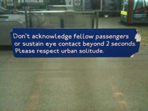
Going Underground has been documenting the recent spate of philosophical thoughts appearing on the Tube's service information whiteboards (including the homage to information design, above, captured by Tom Philips).

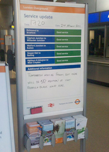
My favourite, though, expresses a somewhat more down-to-earth sentiment (picture by Blake Conolly):


Legibility not great but it says: Tomorrow may be Friday but there will be NO mention of that Rebecca Black song here.

In 1993, I worked on a Customer Information Strategy for London Underground, aimed at improving the organisation's communication, across all media, with its customers. When we recommended, then, improving the use of whiteboards, this wasn't quite what we had in mind. But that was back in those austere days before Pyne and Gilmour. (Nice to see, though, Oval making such good use of the ruled whiteboards, which we endorsed because they improved the legibility of hand-written messages. Not so sure about the gothic script.)

For even more whiteboard 'experience', see here. 

[via David Woodward on Facebook]

02 November 2010

Walk-don't walk icons


Have recently returned from Berlin, where the former East Berlin icons for pedestrian crossings (above) have been adopted across the city (with affectionate references in guide books too). Coincidentally I noticed a comparison between Parisian and New York approaches (below) (many other charming, graphic Paris/NY comparisons, too):


Interesting that, whatever the style, the motionless 'don't walk' figure is only really interpretable in the context of its walking partner. Presumably, that's the reasoning behind the authoritarian palm in New York.

[Paris vs New York via Kottke]

27 January 2009

E-paper emergency signs

Currently under trial in Tokyo. Via Engadget.

19 June 2006

In the end...irresistible

Have been pondering whether to post this link but would be sad to lose it. Have ignored almost everything about the World Cup but this captured my attention. Sometimes I use a similar example in talks about usability but these pictures surpass the example I usually use. (Wish I could translate the Spanish.)

19 April 2006

Pictures from Venice

Street signs that give their users options...


...and the inevitable reach of the mobile phone.