
11 April 2014
Physician heal...
Just looking at a version of the Mini-mental State Examination (MMSE),* a simple test used in clinical settings to assess possible cognitive impairment. The following does not bode well for patients' scores.
* Folstein, M.F, Foltein, S.E., McHugh, P.R. (1975) Mini-mental state: a practical method for grading the cognitive state of patients for the clinician. J Psychiatric Research, 12, 189–98.
04 April 2014
Extravagant claims for big data
Concise review by Tim Harford of the promise of big data and how it can go awry, citing inaccuracies that emerged in the celebrated Google Flu Trends, possibly because Google's own search engines may have been prompting searches, even when the searcher's own symptoms didn't suggest flu. According to an analysis in Science, in 2013 this led to an over-estimate that almost doubled the actual data on the incidence of flu. Harford also covers the problem of multiple comparisons which can yield patterns that, although significant, are spurious. While comparisons that fail to show effects remain in the desk drawer.
Related, but not quite: xkcd's 'little data' representation, Frequency.

Related, but not quite: xkcd's 'little data' representation, Frequency.
27 February 2014
Lent calendars
Looking at Christian Aid's Lent calendars for grown ups...

and for children...

... and think the kids are getting a better deal. (Clever idea, though.)
and for children...
... and think the kids are getting a better deal. (Clever idea, though.)
07 December 2013
The file drawer problem
The Economist's recent article How science goes wrong is a useful reminder of publication biases in science. It recently came up in a discussion at work, which took me back to Rosenthal's paper on 'the file drawer problem' (null results in science are seen as boring and unpublishable, so tend to get filed away, while the study or its analysis is tweaked to produce something that shows a significant effect). Rarely mentioned in research methods teaching.
Rosenthal, R. 1979. The file drawer problem and tolerance for null results. Psychological Bulletin 86/3, 638–641
Rosenthal, R. 1979. The file drawer problem and tolerance for null results. Psychological Bulletin 86/3, 638–641
18 November 2013
Dopplr's passing

15 November 2013
How long should a MOOC be?

[Via Seb Schmoller]
Nominet UK's top 100 social technology enterprises

An eclectic list, presented idiosyncratically (the tiled layout, amongst other things, limits each entry to four classification categories; if tile size is of significance that beats me). But an interesting few moments' browsing. Charlie Leadbeater's description of the selection process provides some useful background.
06 November 2013
Making air safety information palatable
Virgin America's recently released air safety video is getting a bit of press at the moment. Fun on first viewing but even then, too long. Thomson's approach (as a holiday company, aimed at a different audience) is probably equally grating after too much exposure but, at least, is shorter.
I can imagine they both hold the viewers' attention longer than a flight attendant miming to a voice over, but wonder if anyone has tested information retention as a result.
27 June 2013
Another day at the office

13 June 2013

Believing myself to be an efficient-ish sort of person, I imagine I screen out irrelevant detail when searching for information on the web. But, as advertisers know so well, extraneous information impinges on the consciousness of even the most focused researcher. Which is why, I suppose, I was so distracted by the banner image (above) on the web site of the Oxford Institute for Science, Innovation and Society. The dome of the German Reichstag (below) seems a surprising choice... or have I missed some linking significance?

12 June 2013
The impact of introspection on preference choices
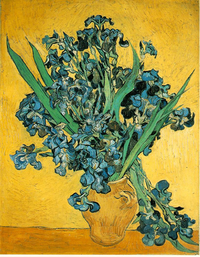 |
| Van Gogh's Irises, from the Rijksmuseum, Amsterdam |
Worth bearing in mind when carrying out studies of visual attributes, as I so often do, that require participants to explain their preferences and choices.
[via Mindhacks]
Writing for the web

Some of our recent work at Centre for Information Design Research for GOV.UK has just been published and blogged. We looked at GOV.UK's internal guidelines for text preparation for the web and provided research background that either supported their guidelines or suggested different approaches to presenting information. Many government web sites are not just providing information, but explaining to people how to do things (make applications, check eligibility, provide evidence etc.) and it is this 'reading to do' that needs particular support in carefully crafted text that is comprehensive but also navigable and concise.
19 November 2012
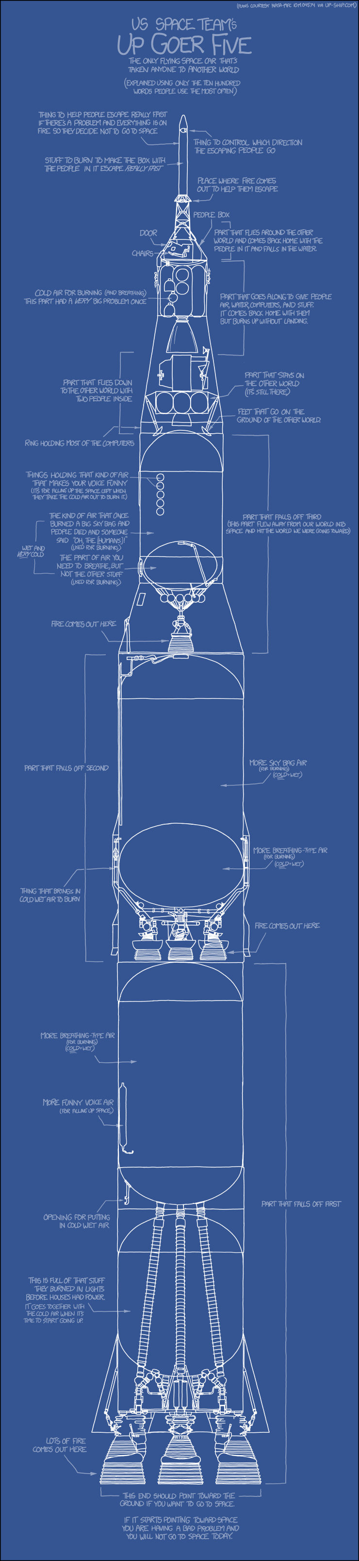
Rockets (and other things) made simple
06 November 2012
Obama Romney campaign spend

Thought provoking. Though you may need anti-glare glasses.
Interesting postscript in John Naughton's Observer column on the Obama campaign's use of data to track and tailor their message to specific supporter groups. Presumably also to raise funds.
[via Fast Company]
05 November 2012
Olympic information access

07 September 2012
Scepticism and phone launches
[via John Naughton, and even more poignant in the light of today's brouhaha over Nokia's bicycle video]
29 July 2012
Standardising patient charts

The Royal College of Physicians has announced a standard, National Early Warning Signs (NEWS), chart to be used across the NHS, to monitor the vital signs of seriously ill patients, in order to detect any deterioration rapidly and reduce medical errors. No one could doubt the sense in this. Deciding what measures to include in the chart, and how those measures are combined into a score, has been the work of a large committee of medical and patient care and safety practitioners, and the chart itself (above) has been designed in collaboration with an e-learning consultancy. With all the input, such a shame to have missed the potential contribution of an information designer or forms designer who could have increased the chart's legibility and usability.
[via BBC News]
On social science writing
Neuroskeptic, generalising a little unfairly, shows how it shouldn't be done...
In a somatic society which promotes visible, idealized forms of embodiment, men are increasingly being interpellated [sic] as image-conscious body-subjects. Some research suggests that men negotiate appearance issues in complex and varied ways, partly because image concerns are conventionally feminized. However, little research hasconsidered how overweight men construct body projects in the context of weight loss, or how men talk to each other about weight management efforts.
... and how it can be
Modern men face a dilemma: society tells them that they ought to have an attractive body, but they are also warned that being concerned about beauty and body image is a feminine trait. However, little research has considered how overweight men think and talk about weight loss.
[via Dorothy Bishop]
23 July 2012
Sontag on aphorisms
Maria Popova at Brainpickings brings together some of Susan Sontag's thoughts on aphorisms, which she (Sontag) describes as impatient thinking. I liked Sontag's characterisation of typical aphoristic subject matter:
the hypocrisies of societies, the vanities of human wishes, the shallowness + deviousness of women; the sham of love; the pleasures (and necessity) of solitude; + the intricacies of one’s own thought processes.
John Naughton cites Auden and Kronenberger as counter-evidence. Maybe the exception that proves the rule, or just a complete non-alignment of two very different perspectives.
13 June 2012
Granularity at BBC weather
BBC Weather have just released a new, fine-detailed forecast, available in two formats:
Graph, which will be interesting to see when there is a wider temperature range:

...or (should you think you need it) table.

According to Jo Wickremasinghe, product manager for BBC weather, all made possible by richer data, available to the Olympic torch relay and now, kindly, made available to the rest of us.
Graph, which will be interesting to see when there is a wider temperature range:
According to Jo Wickremasinghe, product manager for BBC weather, all made possible by richer data, available to the Olympic torch relay and now, kindly, made available to the rest of us.
Subscribe to:
Posts (Atom)

